TYPICALLY, change is a good thing. like, changing a poopy diaper, for example. where once there was poopy, now there is none. and this works! because there was a problem before. but then there are times when changes are made to things that don’t necessarily need change. this may be one of those times.
…prepare yourself.
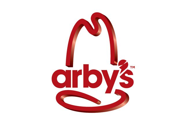
this is where we’ve come. this is the brave, new world you were looking for.
yes, arby’s has changed their logo. and no, this is not my poorly photoshopped guess at what it may be like; this is the actual logo. let’s take a quick trip down memory lane and glance at arby’s former majesty:
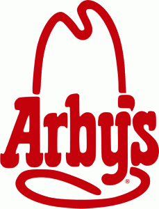
yes, now that’s more like it. much is the same, yet much has changed. the font has lost its fun time western style and moved to a simple, clean piece of modern mundanity. the apostrophe has morphed into what i think is supposed to be a meat slicer, ruthlessly cutting into the ‘s’. and the hat itself (it’s supposed to be a hat) has undergone a 3D makeover, in keeping with the recent surge in popularity of three-dimensional media. this effect can be achieved in photoshop elements, or its nearest competitor, MS PAINT. the decision to leave the font two-dimensional is both baffling and distressing, causing my mind to bend in a similar fashion to when i look at an m.c. escher image.
…and i mourn what we’ve lost. the new logo is not great. what was once vaguely recognizable as a hat (from its own all-but-lost origins) is now some floating abstraction. the new font comes at the cost of its old identity. it’s no wendy’s train wreck, but it’s not an improvement.
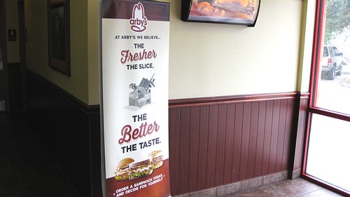
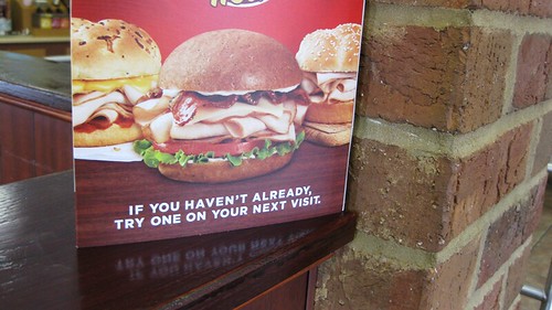
it’s not just a logo – it’s a whole rebranding. they are pushing the freshness/sliceness angle, which works for them what with all the slicing they do. and to increase that amount of slicing, they are throwing in a whole new chunk of meat to cut at: turkey bird.
arby’s has introduced three turkey-blasted sandwiches – turkey classic, turkey ‘n cheddar classic, and the grand turkey club. basically, it’s as though this turkey meat is floating alongside the beef meat as just another option. which is a pretty decent idea. in a real-life deli, you get a whole assortment of different kinds of meats, all of which are sliced up right in front of your face. this is the same as that! fresh! variety! etc!
arby’s offered to buy me one of their new sandwiches. to check out dat new meat. i opted for the grand turkey club, assuming “grand” meant that it was the best. the other sandwiches are pretty much identical to their beef analogues, with the addition of mayonnaise, honey mustard, or ranch dressing to the classic. the grand turkey club is along the lines of a non-grand turkey club, with turkey, lettuce tomato and mayo, swiss cheese, and bacon all on a harvest wheat bun rather than toast.
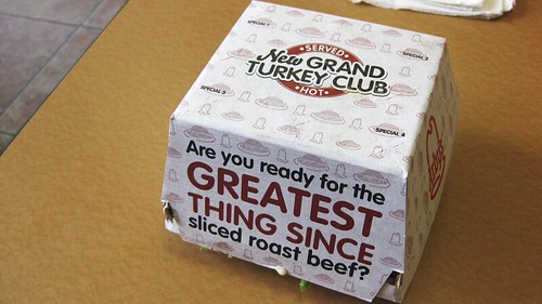
the box claims this is the greatest thing since sliced roast beef. there is also lettuce escaping through the bottom, and a dab of mayonnaise has gotten out as well. these are indicators of things to come.
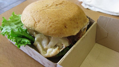
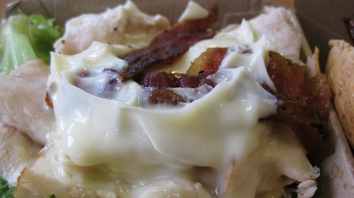
open the box up, and we find with a giant turkey sandwich just waiting to burst out. it’s all packed in there, with good amounts of everything. a solid amount of turkey, enough to satisfy my hunger. nice, crisp lettuce, and fresh tomato, playing a big part in the overall feel of the sandwich. decent slices of bacon. probably some swiss cheese. and a full bucket of mayo.
oh god. yeah. there’s a lot of mayonnaise here. now, i’ve gone to great lengths to make it known that i do not care for mayonnaise, but i can tolerate it. i believe there was too much mayonnaise on here even for a lover of mayonnaise. it was the first taste you noticed. it was almost the only taste you noticed. and it really took away from my enjoyment of this sandwich.
but let’s assume, for the sake of a fair review, that this sandwich was never intended to have so much mayonnaise on it. taking it for what it is, the sandwich is not bad. their toppings are decent (good lettuce and tomato, decent pepper bacon). the swiss cheese was all but lost behind the mayo, which is disappointing. the bun was actually a very solid choice, playing a bit sweet against the turkey.
and the turkey itself? it was good. it was not great. it was not bad by any means. good turkey. tender, with good flavor. a bit salty, not overwhelmingly so. but nothing special. i did not detect any exciting seasoning, nothing mind blowing. it was just turkey.
they politely request you try the turkey. you would not be worse off for it. but what this boils down to, for me, is that the turkey is not good enough by itself to convince me to go to arby’s. it does not change what arby’s is to me. for me, it is just another menu item. and, speaking as someone who loves arby’s roast beef sandwiches (RIP big montana!!), the presence of turkey as an option is not going to change my order from whichever sandwich they can pack the most roast beef onto. all i want from arby’s is a pile of roast beef on a warm, pillowy bun, doused in a packet of arby’s sauce.
as with the old logo, all i want from arby’s is simplicity, and what i’ve grown to love them for. aaaaaaaand maybe a talking oven mitt.
